Loading...

Website Redesign

22stars

UX/UI · Research · Redesign

Communicating impact clearly is essential for building trust. The 22STARS website redesign focuses on clarifying the mission, strengthening trust, and making donation paths more visible and accessible.

Project Overview

22STARS Foundation supports Ugandan communities through economic, social, and cultural development.

To increase donations, the website needed clearer communication and a more professional presence for a B2B audience.

I redesigned the main experience by simplifying content, improving visual quality, and making donation paths more visible and intuitive.

Research

The Problem

Charity websites often struggle with clarity and structure, making it harder for users to understand the mission or take action.

An initial usability evaluation of the 22STARS website revealed issues across content, navigation, and overall credibility.

Usability testing

To validate these assumptions, I conducted usability tests focused on how users understand the mission, navigate the site, and complete key actions like donating or becoming a partner.

The sessions revealed confusion around where to donate, unclear differences between contribution options, and difficulty finding key information such as volunteering details.

Insights

Testing revealed consistent usability issues that were limiting users’ ability to understand and take action.


  • Content was too dense, with no clear hierarchy
  • Mission and donation options were unclear
  • Navigation created friction across key journeys
  • Visual quality weakened credibility
  • Some pages were incomplete or empty

Define

The Vision

After synthesising insights from usability testing, I prioritised key pain points using an impact–effort matrix to focus on the most valuable improvements.

To guide the design process, I defined a set of principles aimed at reducing complexity, improving clarity, and ensuring accessibility across different user groups.

The design direction was shaped around a brand personality that communicates credibility, openness, and care, reinforcing trust while clearly expressing the foundation’s impact.

Principles

• Do less but create more value
• Consistent but bold
• Be transparent when it comes to content
• Accessible to different user groups

Communication

• Conscientiousness
• Credibility
• Impact
• Care

Design

Experience Strategy

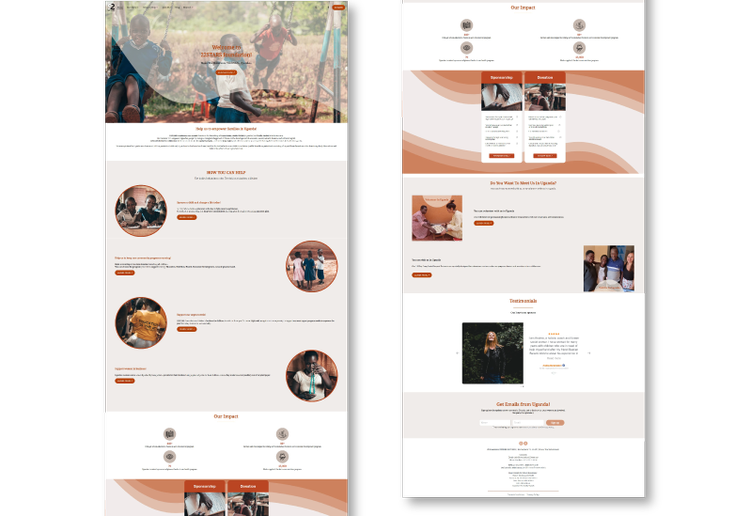
Users are more likely to take action when the experience feels clear, aligned with their values, and easy to navigate.

Key drivers for engagement:

  • Visible and relatable values on the homepage
  • Simple, low-friction forms
  • Clear and intuitive navigation
  • Accessible experience across devices

Design Focus

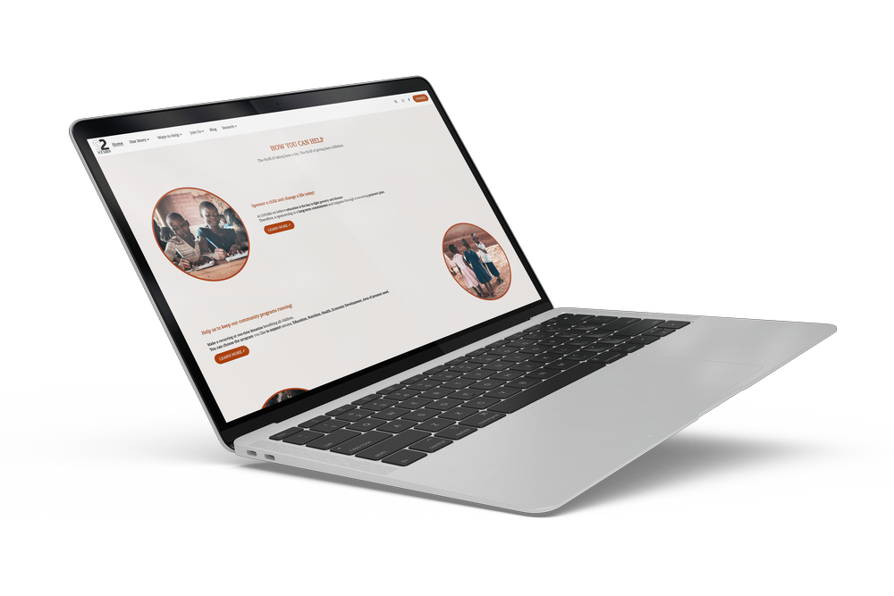
Based on these principles, the redesign focused on simplifying the experience and guiding users toward action.

This included improving the navigation structure, restructuring content with a clearer hierarchy, and making primary and secondary calls to action more visible and consistent, supported by stronger visuals.

Before

After

Before

After

Prototype

After analysing the research and usability findings, I translated the key improvements into a high-fidelity prototype focused on clarity, trust, and ease of action.


The experience was redesigned to:

  • Guide users immediately toward the “How to help” section
  • Create a clear hierarchy for content and calls to action
  • Simplify navigation and reduce friction across key journeys
  • Improve content to better communicate impact
  • Strengthen visual consistency through color and imagery

Next Projects...

Niseclothing

Designed and developed a Shopify e-commerce website focused on a clear, direct product experience.

AS

Developed a bold visual identity for a modern hairdresser brand built on precision and structure.

Scroll to Top