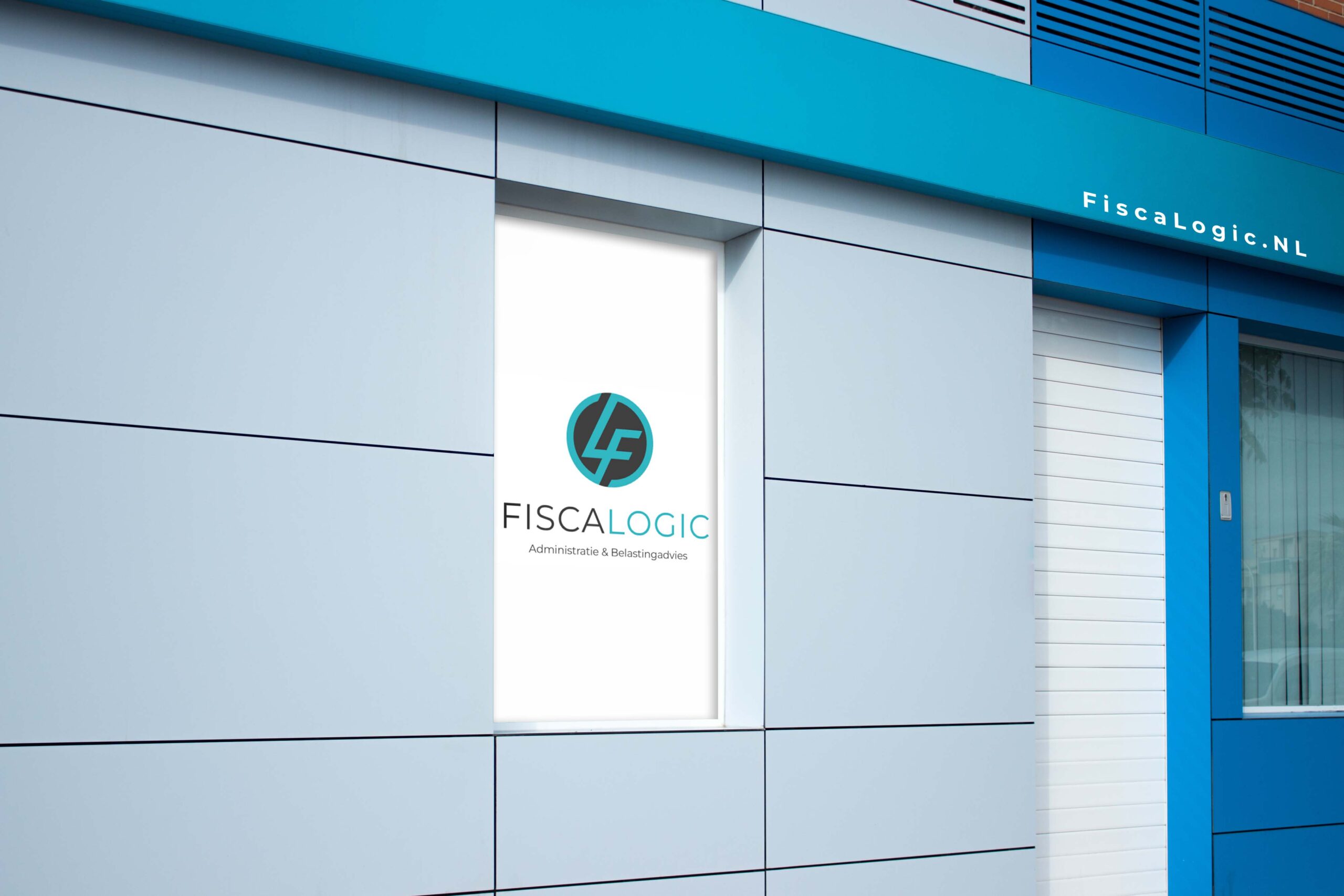
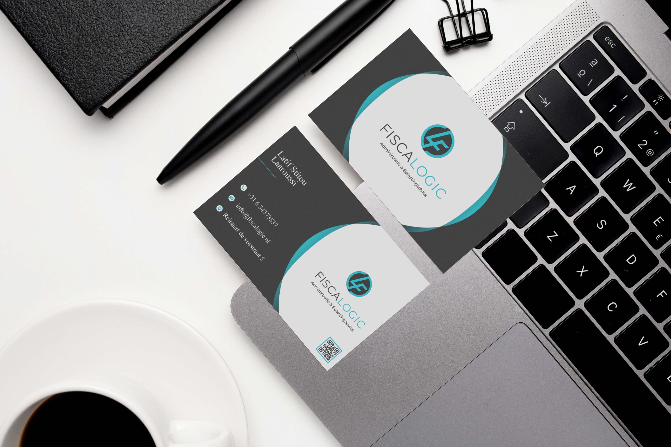
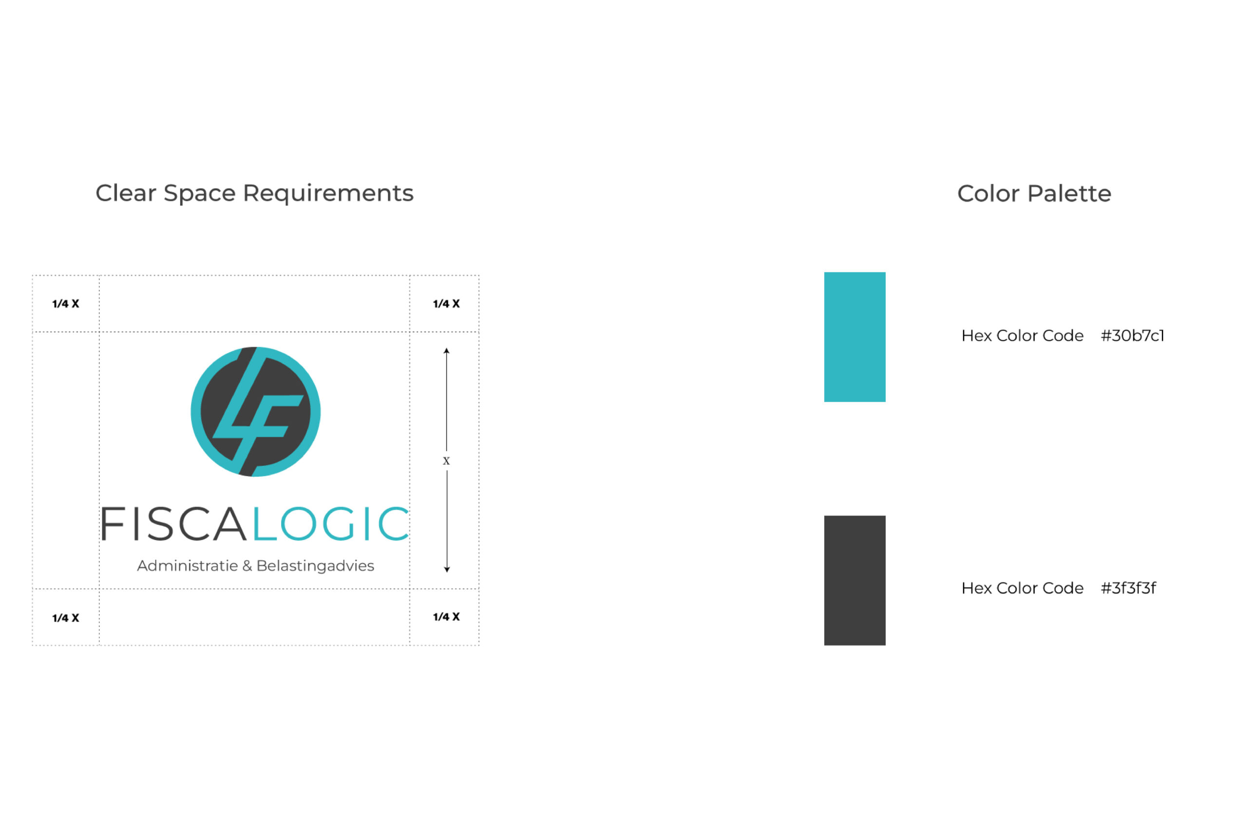
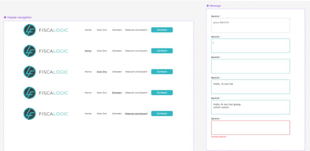
The logo combines the initials “F” and “L” into a unified typographic symbol within a circular form, reflecting structure, balance, and reliability.
A clean, minimal visual language defines the identity, supported by a professional palette of teal and dark grey to convey trust and clarity.
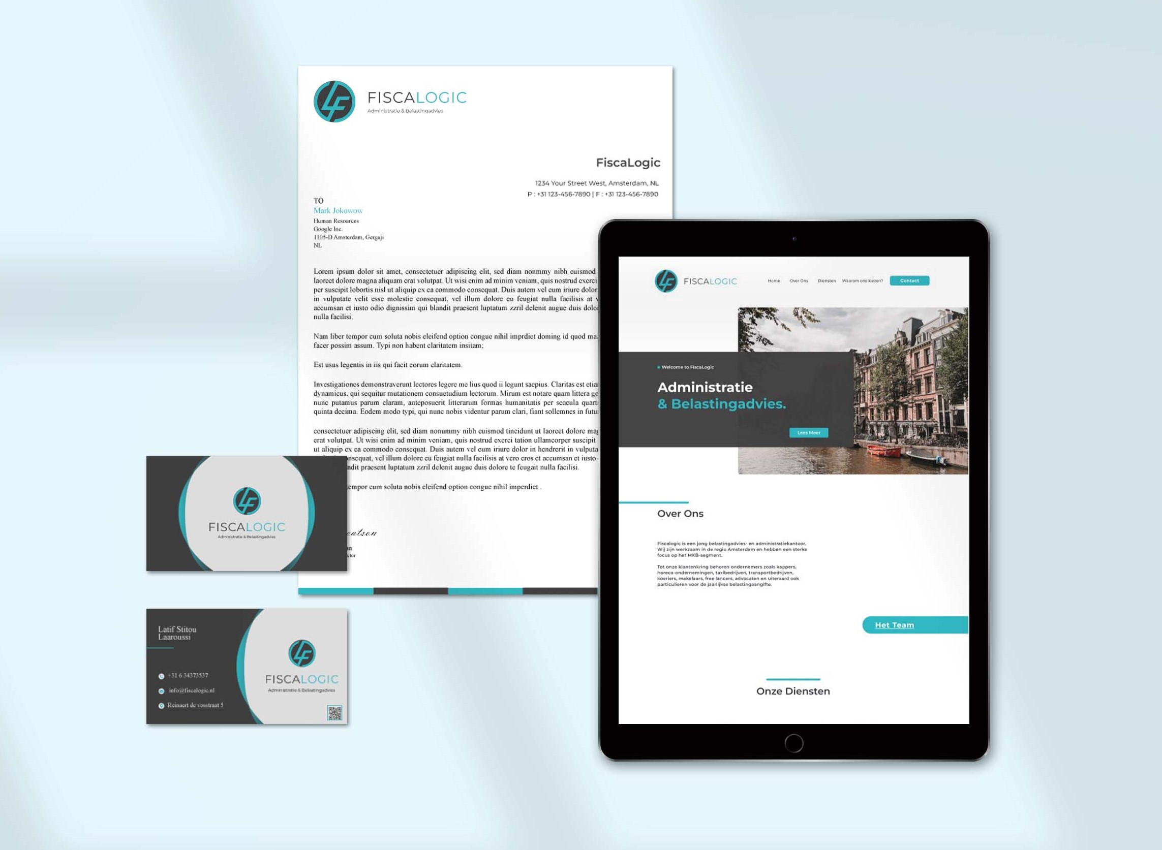
The system extends into the website, where layout, spacing, and hierarchy ensure readability and a clear, structured user experience across key pages.